Page 2 of 2 [ 22 posts ]  Go to page Previous  1, 2

Apple_in_my_Eye
Veteran
Veteran

User avatar

Joined: 7 May 2008
Gender: Male
Posts: 4,420
Location: in my brain

14 Apr 2009, 5:00 pm

I like both, although I think Dussel's image would be better as a poster, and SC's as a logo.

Not to take this thread OT, but for the cat + rainbow fans, I googled that and there's a lot of surprisingly cool images --> link


Apple_in_my_Eye
Veteran
Veteran

User avatar

Joined: 7 May 2008
Gender: Male
Posts: 4,420
Location: in my brain

14 Apr 2009, 8:32 pm

Just trying out SC's idea & Dussel's suggestion about the text. If anyone wants the .SVG file, PM me.

Image

Image

Image

Image


SabbraCadabra
Veteran
Veteran

User avatar

Joined: 21 Apr 2008
Age: 41
Gender: Male
Posts: 7,777
Location: Michigan

14 Apr 2009, 10:05 pm

Dussel wrote:
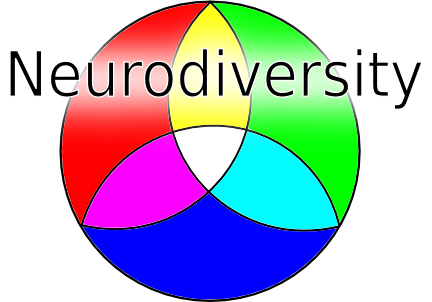
The text in SabbraCadabra's version is very hard to read.


Someone else said the same thing, I think it would be easier to read in a finished form, as I just sketched it out real quick, and didn't worry too much about keeping the letters uniformly in size or anything.

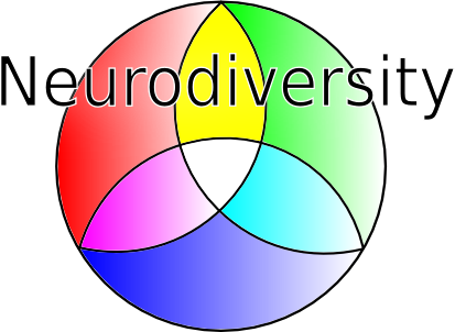
Apple_in_my_Eye wrote:
Just trying out SC's idea & Dussel's suggestion about the text. If anyone wants the .SVG file, PM me.


Nice. Can you do one that looks like mine, please? You can have the rays stick out a little more than the letters are, I meant it to look that way but didn't get it right.

Doesn't have to be exactly the same type of font I used, it was just easy to do it that way with the line tool.


_________________
I'll brave the storm to come, for it surely looks like rain...


ignisfatuus
Toucan
Toucan

User avatar

Joined: 5 Feb 2008
Age: 45
Gender: Male
Posts: 261
Location: Canada

14 Apr 2009, 11:53 pm

Quote:
I also think it should be 'autistic' rather than 'asperger'. You don't want to leave anyone out.


I disagree. Kannerian autism (or "classic" autism) receives the lion's share of funds and media attention. I wouldn't mind creating a further division by having an adult AS symbol or movement, as this demographic gets the shaft.


_________________
"The world is only as deep as we can see. This is why fools think themselves profound." - R. Scott Bakker, The Judging Eye


astaroth666
Emu Egg
Emu Egg

User avatar

Joined: 21 Oct 2008
Gender: Male
Posts: 5

15 Apr 2009, 12:22 am

Image

LOL!


Apple_in_my_Eye
Veteran
Veteran

User avatar

Joined: 7 May 2008
Gender: Male
Posts: 4,420
Location: in my brain

15 Apr 2009, 2:25 am

Ok, here's some attempts, but they're still hard to read no matter what font or size I've tried. An artist might know how to fix that, but that's the best I know how to do.

EDIT: To keep from cluttering this thread up too much, I've moved the images to
--> http://substancelessblue.deviantart.com/gallery/ <--