Page 1 of 6 [ 89 posts ]  Go to page 1, 2, 3, 4, 5, 6  Next

dexkaden
Veteran
Veteran

User avatar

Joined: 29 Dec 2005
Gender: Female
Posts: 1,967
Location: CTU, Los Angeles

13 May 2007, 12:49 pm

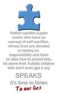
Not a new logo for Wrong Planet, but a new Logo for the Autistic Community as a whole. I don't really like the puzzle piece because it is associated with such causes as Cure Autism Now and Autism Speaks. I think that we ought to come up with our own logo. Symbols are important. While I like puzzles as much as the next person (probably more so, actually), I just think the puzzle piece is kind of sending the wrong idea. We are trying to be seen as equal in our own right, to be accepted as is without needing to be "solved" or "fixed." While I am not necessarily against research, I dislike the perception being created by organizations such as Autism Speaks and Cure Autism Now. So, any ideas on a new symbol, a standard, if you will? A standard is a flag, emblematic figure, or other object raised on a pole to indicate the rallying point of an army, fleet, etc.


_________________
Superman wears Jack Bauer pajamas.


TG
Toucan
Toucan

User avatar

Joined: 30 Dec 2006
Gender: Female
Posts: 284
Location: The mighty rivers of BC

13 May 2007, 1:00 pm

How about the wonderful exclamation mark :!: :!: :!: :!:

It says to me "Hey! Look! We're people, too!! We know what we're talking about!! How about asking us?!""

Just a spontaneous thought.... :!:


_________________
There are no stupid questions?


willem
Veteran
Veteran

User avatar

Joined: 6 Apr 2007
Age: 59
Gender: Male
Posts: 1,148
Location: Cascadia

13 May 2007, 1:29 pm

I would be thinking of a sphere/marble-type symbol, with an outward-looking scenery on it (e.g. a beautiful landscape, or stars).
It bugs me a lot that autistics are misinterpreted as "inward-looking" because we don't exclusively and obsessively direct our attention to other people, who think they are all that's interesting and valuable in this universe.


_________________
There is nothing that is uniquely and invariably human.


the-over-analyzed
Toucan
Toucan

User avatar

Joined: 15 Mar 2007
Gender: Male
Posts: 266
Location: United States

13 May 2007, 2:25 pm

How about a tree? I like the macadamia tree.
Here is one:
Image

And there are some other trees over at http://www.australisplants.com.au/macad ... ieties.htm

The macadamia tree produces some very delightful, classy and popular nuts. This logo would say "we can laugh at ourselves". Also it says that we all hang together like all the macadamias hang togethjer on the tree. Just as random idea, please don't get ticked off. :wink:


TG
Toucan
Toucan

User avatar

Joined: 30 Dec 2006
Gender: Female
Posts: 284
Location: The mighty rivers of BC

13 May 2007, 3:04 pm

So we're all nuts...?
HA!
That's good!


_________________
There are no stupid questions?


sigholdaccountlost
Veteran
Veteran

User avatar

Joined: 10 Jul 2006
Age: 33
Gender: Female
Posts: 2,207

13 May 2007, 3:18 pm

I would say an acorn...but I think that's already been taken.


_________________
<a href="http://www.kia-tickers.com><img src="http://www.kia-tickers.com/bday/ticker/19901105/+0/4/1/name/r55/s37/bday.png" border="0"> </a>


SocialParadox
Blue Jay
Blue Jay

User avatar

Joined: 19 Apr 2007
Gender: Male
Posts: 94
Location: Siena, Italy

13 May 2007, 4:13 pm

willem wrote:
I would be thinking of a sphere/marble-type symbol, with an outward-looking scenery on it (e.g. a beautiful landscape, or stars).
.


I definitely agree ! !! (Look at my avatar...) :wink:


The_Cucumber
Veteran
Veteran

User avatar

Joined: 4 May 2007
Gender: Male
Posts: 514

13 May 2007, 4:17 pm

Aspie's for Freedom use the infinity symbol.


Avian
Deinonychus
Deinonychus

User avatar

Joined: 2 Apr 2007
Gender: Male
Posts: 383

13 May 2007, 4:20 pm

Image


The full explanation for the emblem at the center is as follows (I posted this here before as "asperion"):

Image


People kept remarking that it looked like a deformed swastika; but the same could really be said of most simple, straight line geometric forms rendered boldly.


_________________
░░▒▒▓▓██▓▓▒▒░░


gekitsu
Veteran
Veteran

User avatar

Joined: 4 Apr 2007
Age: 42
Gender: Male
Posts: 693
Location: bavaria/germany

13 May 2007, 4:27 pm

that infinity symbol doesnt really do anything for me.
the raised fists one looks cool, and sure would make the coat-of-arms of choice when the aspie wars break loose, yet i think its a tad too martial looking (i appreciate that aesthetically, but i am not sure if this is a wise choice in operative terms)

i kind of like the puzzle piece analogy... it just needs refinement. its not about having a "bad" puzzle piece that needs to be tailored to fit, its about having a piece of a completely different puzzle that doesnt fit in. i pondered about a nine-piece square puzzle, white pieces with black outline, either top row or bottom row center piece missing and having a non-fitting puzzle piece in solid black next to the gap.
wont fit in, and even if it is tailored/mauled to fit, it wont fit with the picture.


kiki3
Velociraptor
Velociraptor

User avatar

Joined: 31 Mar 2007
Gender: Female
Posts: 468

13 May 2007, 4:28 pm

How about the slogan: Proud To Be Different

And, this for our logo:

Image

:lol:


dexkaden
Veteran
Veteran

User avatar

Joined: 29 Dec 2005
Gender: Female
Posts: 1,967
Location: CTU, Los Angeles

13 May 2007, 5:22 pm

Right, well, I don't necessarily dislike the puzzle piece. Actually, now that I think about it, all we really need to do is change the meaning of the symbol, not the symbol itself, so perhaps we HIJACK the puzzle symbol and add a slogan to it, like the one mentioned above, "Proud to be Different," or maybe "Different, Not Defective," or something like that?


_________________
Superman wears Jack Bauer pajamas.


CockneyRebel
Veteran
Veteran

User avatar

Joined: 17 Jul 2004
Age: 49
Gender: Male
Posts: 116,730
Location: In my little Olympic World of peace and love

13 May 2007, 5:29 pm

I like Kiki's idea. 8)


the-over-analyzed
Toucan
Toucan

User avatar

Joined: 15 Mar 2007
Gender: Male
Posts: 266
Location: United States

13 May 2007, 8:29 pm

kiki3 wrote:
How about the slogan: Proud To Be Different

And, this for our logo:

Image

:lol:


I think this could be our new flag. I wonder if those are supposed to be rubber ducks or real ducks. I really liked the macadamia tree for a logo, but ducks are really good for a flag. It's even kind of shaped like a flag. If we need a smaller logo with a duck we could just get the one duck like:Image

The Puzzle Piece seems a litlle bland and not wild enough for us.

Oh, and maybe wrongplanet will let us use this guy as our mascot:

Image
If you ask me the green alien dude is already more of a logo for our community that the puzzle piece...


KBABZ
Veteran
Veteran

User avatar

Joined: 20 Sep 2006
Age: 34
Gender: Male
Posts: 6,012
Location: Middle Earth. Er, I mean Wellywood. Wait, Wellington.

14 May 2007, 12:50 am

How about this, t-o-a?

Image

Collaged that using the WP logo and Photoshop! I also think one of MC Escher's confusing stairways would be neat:

Image

And here's a CAN logo re-design:

Image

And just for laughs:

Image


_________________
I was sad when I found that she left
But then I found
That I could speak to her,
In a way
And sadness turned to comfort
We all go there


Cyanide
Veteran
Veteran

User avatar

Joined: 24 Sep 2006
Age: 35
Gender: Male
Posts: 2,003
Location: The Pacific Northwest

14 May 2007, 3:07 am

Avian wrote:
Image


People kept remarking that it looked like a deformed swastika; but the same could really be said of most simple, straight line geometric forms rendered boldly.


I think it looks more like a Hebrew letter myself.